Compass
TL; DR Summary
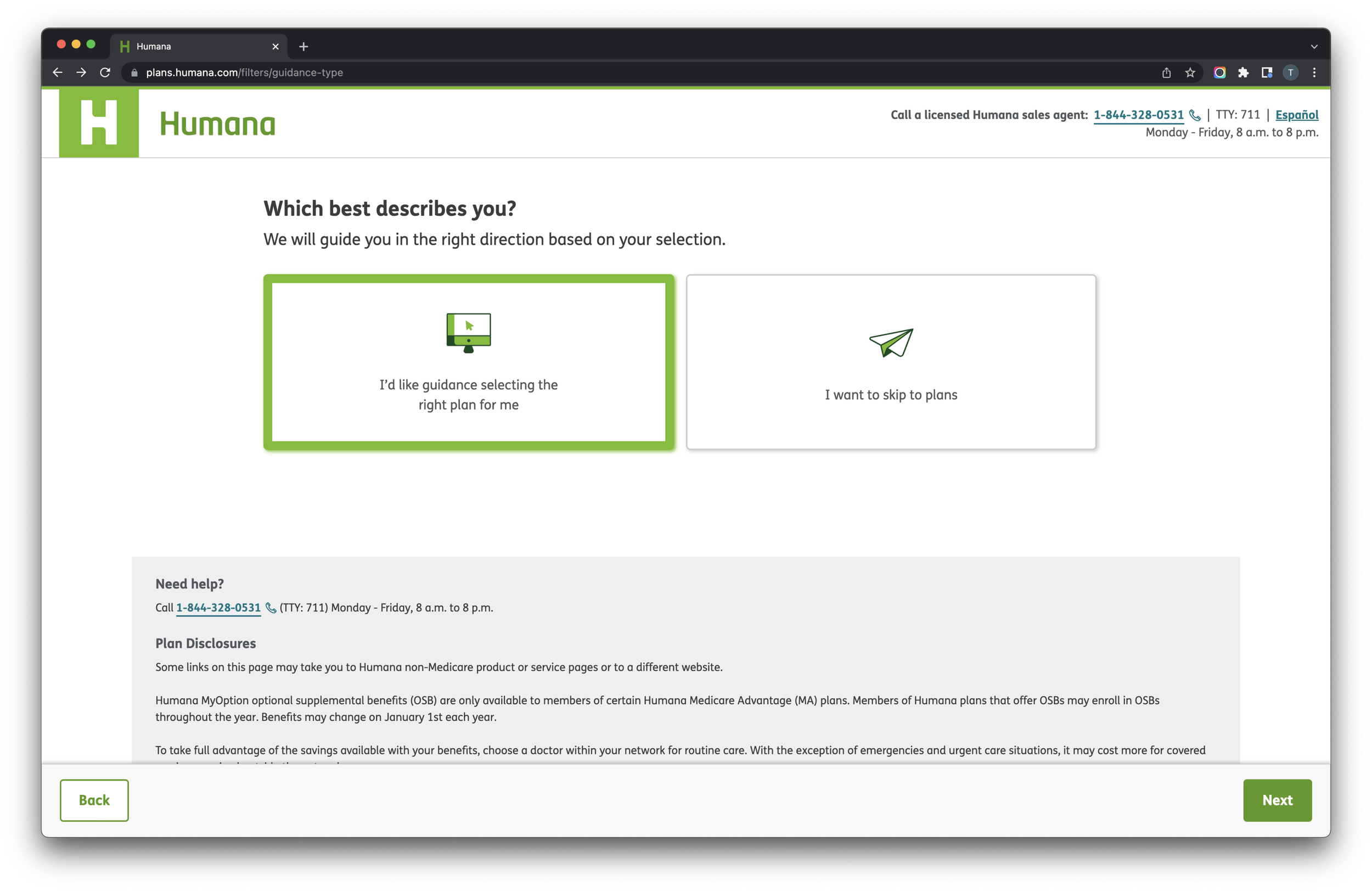
The Compass product was initially focused on Medicare education, but shortly after I joined, the team pivoted to simplify Medicare plan shopping and enrollment, targeting individuals over 65. I led product design as part of a cross-functional team that conducted the foundational discovery and development of the MVP product launch. Our qualitative interviews revealed insights into the Medicare shopping journey, prompting the team to embed with field sales agents in Louisville for contextual inquiry. Shadowing agents highlighted the importance of doctor coverage and prescription drug costs in plan selection. Co-creative exercises and card-sort activities informed the design of a wizard-style interface for the Compass tool, later renamed VIPR (Virtual Intelligent Plan Recommender). A/B testing during the annual enrollment period demonstrated VIPR's superior conversion rates, leading to its adoption as Humana's default direct-to-consumer sales experience. VIPR's success paved the way for Path, an omnichannel sales and enrollment tool. Today, VIPR is accessible at plans.humana.com, showcasing the culmination of research-driven design and successful implementation in improving Medicare enrollment experiences.
Inception
The Experience Center at Humana launched its new Boston studio by partnering with the agency frog design to conduct ethnographic discovery around the subject of health and wellness. These research efforts identified several problem spaces that were ripe for exploration:
Finding a new doctor
Caring for your sick and aging loved ones
Medicare Education
Taking control of your health data
I joined the Compass team shortly after the initial ethnography was conducted and the team was pivoting from the idea of medicare education to focusing more on medicare plan shopping and enrollment. Our target audience for the product was anyone over the age of 65 who would be likely to enroll online or folks who were about to age into Medicare. For the purposes of research, however, we focused on people who were new to Medicare or recently enrolled in a Medicare program. That way we could learn about their experience enrolling in Medicare for the first time.
An early whiteboard sketch of the proposed user flow
Our goal was to simplify and demystify the process of shopping and enrolling in a plan. The business challenge at the time was to ultimately increase the number of direct to consumer medicare enrollments through the company website, in an effort to reduce the number of calls to our telephonic sales agents and increase our overall enrollments. I served as a product designer as part of a combined Humana/frog team of product managers, product designers, software engineers, and data scientists. I rolled off the team after establishing the foundational user experience flows that are still in use today. This was the research process we followed in achieving our early design success.
Our research participants in our Boston studio
Research
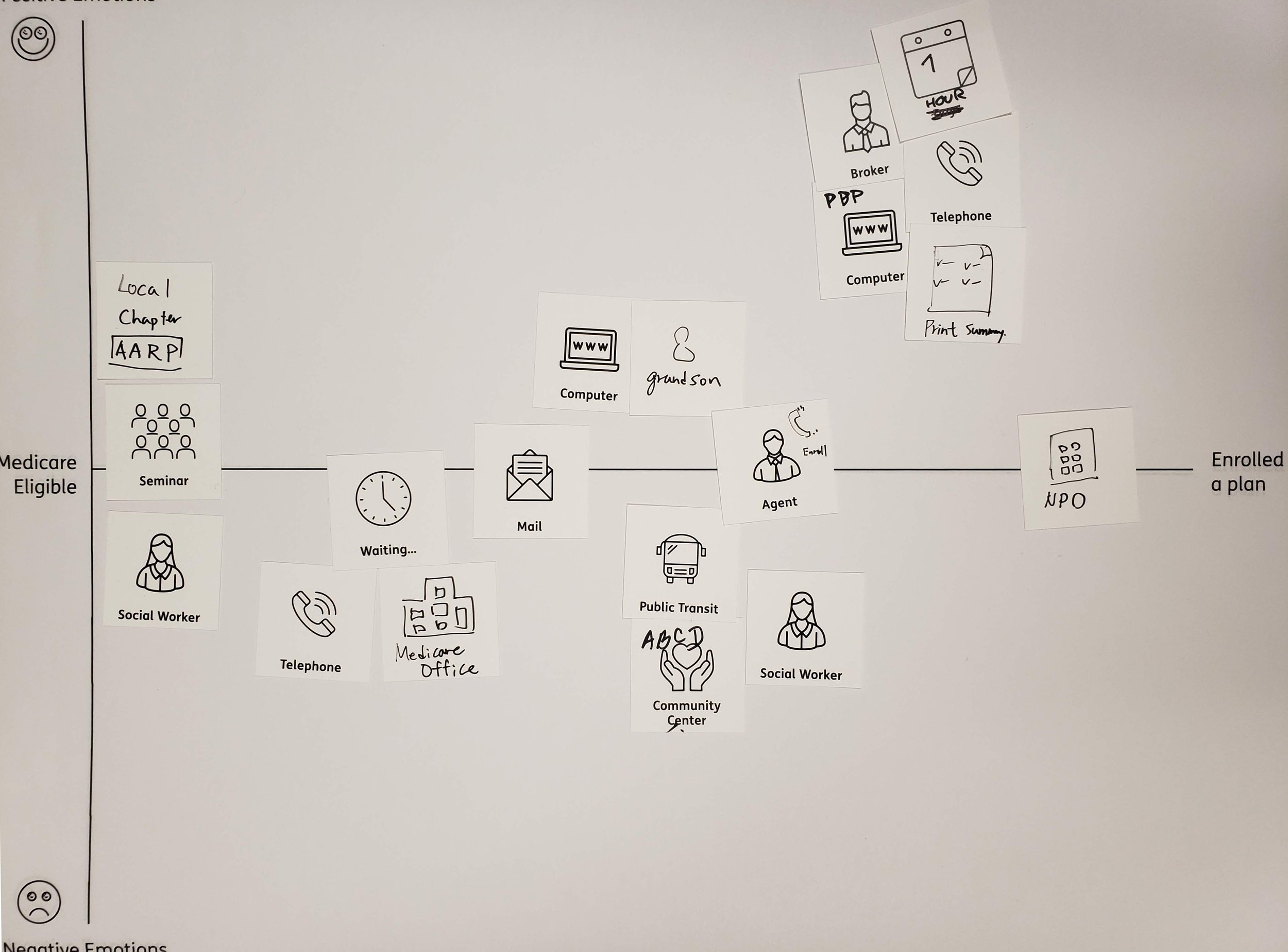
We started our discovery research by conducting qualitative in-person interviews in both our Louisville and Boston offices. We ran a co-creative exercise with our participants, having them draw out their own personal medicare shopping journey onto a map and highlighting when it felt good and when it felt hard. We gave them cards with iconography to help jog their memories about all the many aspects of the experience. We learned that the process for many people starts much earlier than we expected, when the mail started arriving before their age-in date. Medicare insurance companies are known for being very persistent in terms of showing up in your mailbox as you approach Medicare age. Examples of their personal journeys are shown below.
My colleague setting up the camera for our remote teammates
Contextual Inquiry
As part of our continuous discovery, we decided to learn more about the sales process by embedding ourselves with our field sales agents. The team traveled to Louisville, Kentucky, and conducted a series of ride-alongs, following an agent to customers’ homes. Throughout the course of their daily work we saw how they generate and follow up on leads and conduct conversations with prospective members, eventually enrolling them in new medicare plans. During the course of that research, we were able to identify the key questions that agents asked to help narrow plans down for prospective members.
What kind of insurance were they interested in: Medicare Advantage or Medicare Supplements?
Did they have a doctor that was important to them?
What kind of drugs are they currently prescribed?
Do they qualify for medicaid?
What kind of network do they prefer, PPO or HMO?
Among other key insights we gathered from shadowing our agents was just how important it was for people to have the doctors they currently see covered by their new insurance policy. Additionally, whether their prescription drugs were covered, and at a cost they could afford. Compared to the earlier journey mapping exercise we had done with participants, the process of learning about your options, choosing, and enrolling in a plan with an agent was much more efficient, sometimes taking only days from start to finish as opposed to weeks or months for those who chose to go it alone. We also learned the key information that customers need to know in order to identify which plans to choose from:
Monthly Premium
Provider copays and coverage
Prescription drug costs and coverage
Annual Maximum Out of Pocket
Deductibles
Additional benefits like Dental, Vision, Fitness
Co-creation
We used this information to inform the flow of a wizard-style interface that aimed at directing customers in a manner similar to our sales agents and then customized the information display to focus on what folks wanted to see most. Our next step in our weekly in-office research sessions was to conduct a co-creative card-sort activity to get participants to prioritize more detailed information about the insurance plans to understand what information was most relevant to them, allowing us to organize the hierarchy of the plan detail view. Typically a plan's complete information is gathered into a comprehensive document known as a statement of benefits and this round of interviews allowed us to understand which data points in that document were truly relevant to the consumer.
A co-creation activity for plan related information
Results
We used all of these research insights from this foundational research to inform a product roadmap for the Compass tool that would ultimately be renamed internally, as the Virtual Intelligent Plan Recommender, or VIPR. Its key features are a guided flow with simple choices that would lead you to 2-3 recommendations based on the information you had provided the system, the ability to estimate your out-of-pocket costs from prescription drugs, and to check which plans covered your important medical providers.
The original mvp flow diagram
Our product was A/B tested in a 50/50 split with the current plan selection tool on Humana.com during our annual enrollment period (AEP) when most consumers are enrolling in new medicare plans. Our tool proved to convert prospective customers at a higher rate, and VIPR eventually replaced the existing plan flow and display to become the default direct-to-consumer sales experience for all of Humana. VIPR’s success eventually led to the development of a platform for omnichannel sales experimentation that grew into our agent sales and enrollment tool, Path, which I later supported in its post-MVP phase. You can use and view VIPR today at plans.humana.com.


